Graphic Design
Branding Projects
The Logo:
Jennifer’s Heaven
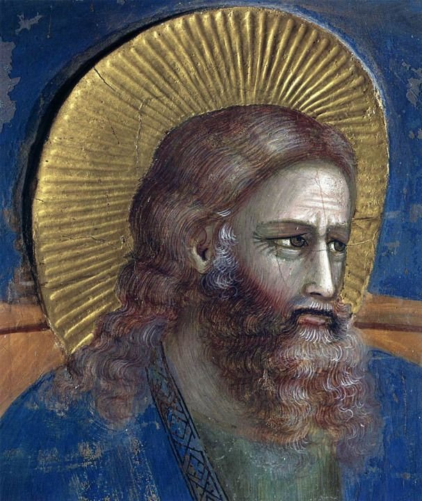
In order to redesign the business card, I had to first design the logo from scratch. I knew I wanted to depict a halo for the logo, but I wanted to add elegance to it instead of just including a simple modern halo. I was drawn to Renaissance paintings of divine figures because of how different but elegant their halos appeared compared to modern day depictions.
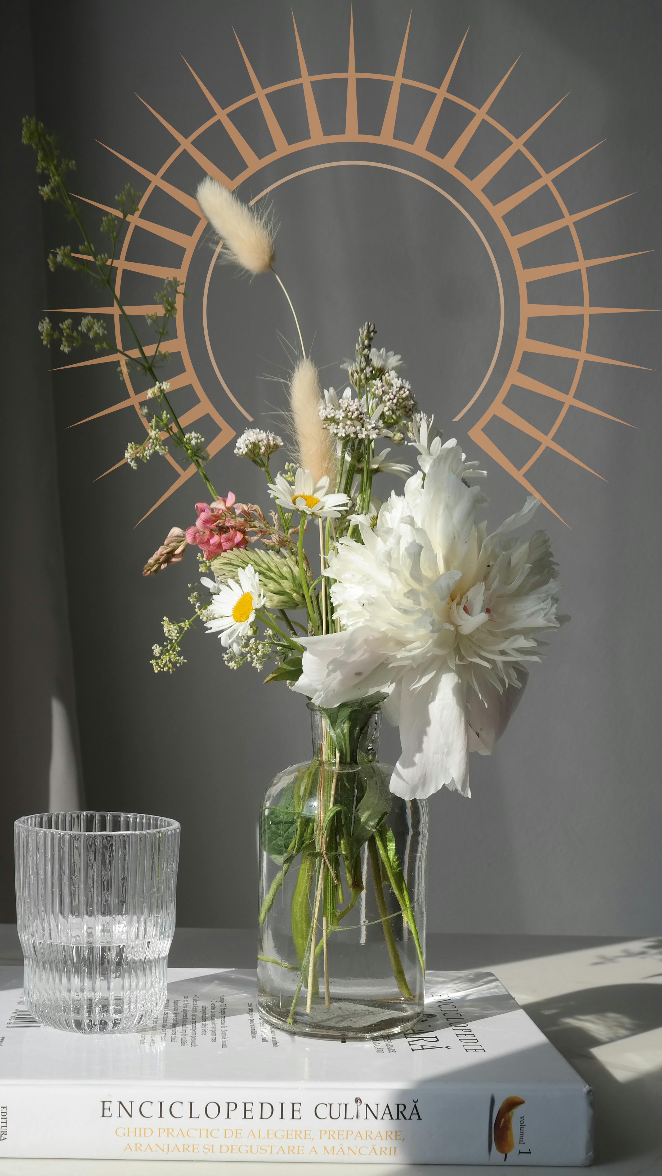
I ended up with a halo that combined elements of all of these different depictions to create a unique take on the halo. My goal was to make sure the halo was distinct enough that it can blend harmoniously with the text logo but also exist standalone to play with for branding purposes:
The Brief:
“We are currently looking for new ways to expand our business. We first want to find new potential investors and get a little bit more status within the floral business. In order to do so, we need to elevate the image of our company and with that, re-design our business card. Our current card is quite old and designed by me, and I am by no means a designer. Therefore we are currently seeking out help with the design and getting it professionally done by someone who is more specialized than me this time. We would like it to be clear that we are a floristry, whilst still maintaining a very professional look. We do not want it to be overly colorful and childish since we are quite a bit more high-end compared to other florists. We want the card to of course say Jennifer's Heaven, but also that we are a floristry, our phone number 201-629-5550, and our email info@jennifersheaven.com. Most of the design choices are completely up to you, however, it would be nice though to give the card a bit of a heavenly look since it is a nice play on the business' name. For that same reason, we would also like rounded edges, to make it look more like a cloud.”
mockup of the business card
Color Palette
With this color palette, I aimed to keep a color scheme that is usually depicted with heavenly imagery with blues and golds, but keep it soft and muted.
Fonts:
Header Font: Bodoni 72 Book
Paragraph Font: Maceanas Thin
Studio 2 Home Edition
The Brief:
This was a 30 minute show that my studio production class at Lee University made during the 2020 Lockdown. I was tasked with designing the graphics for the show. This included designing a logo from scratch, animating lower third graphics, animating transition sweepers, and creating ‘coming up’ full screen graphics
The lower third graphics animated.
The Logo:
With the show’s name being titled ‘Studio' 2: Home Edition,’ I played with the idea of a house shape being in the logo. I settled on the idea of the house being separated into two pieces in order to play with the pieces moving during the sweeper animations as such:
I also designed and animated a horizontal version of the logo to be displayed with the lower third graphics
(the sweeper animations for the show)
Miscellaneous Works


